Data looks better naked
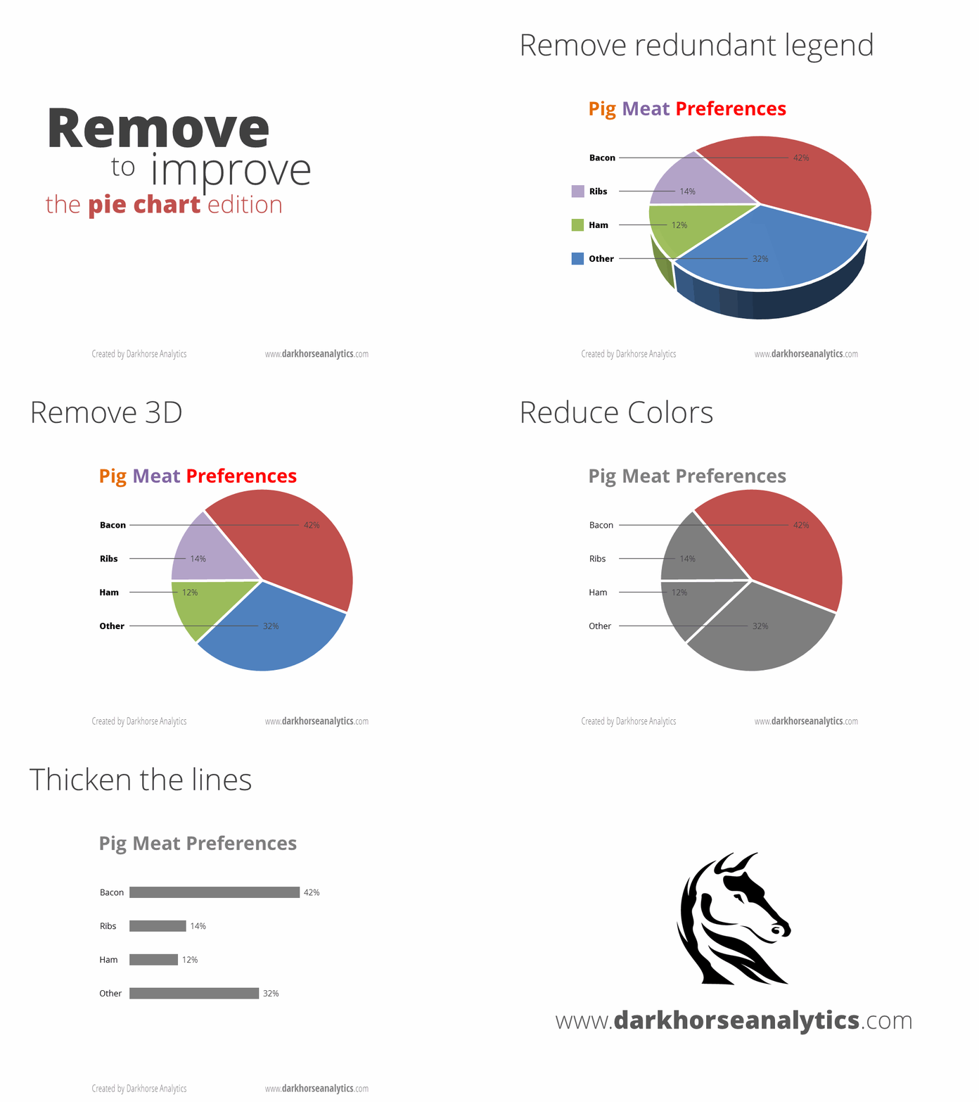
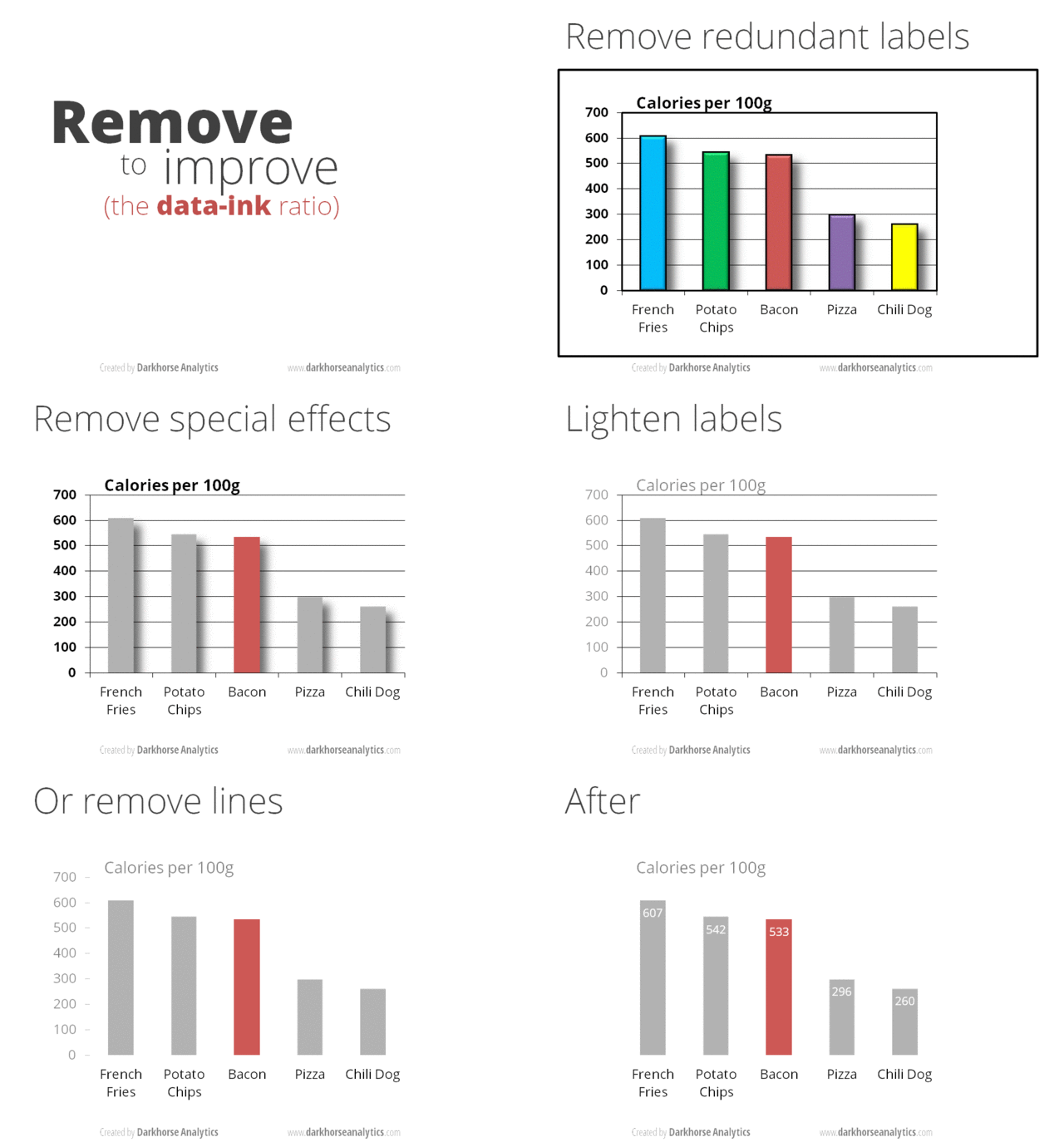
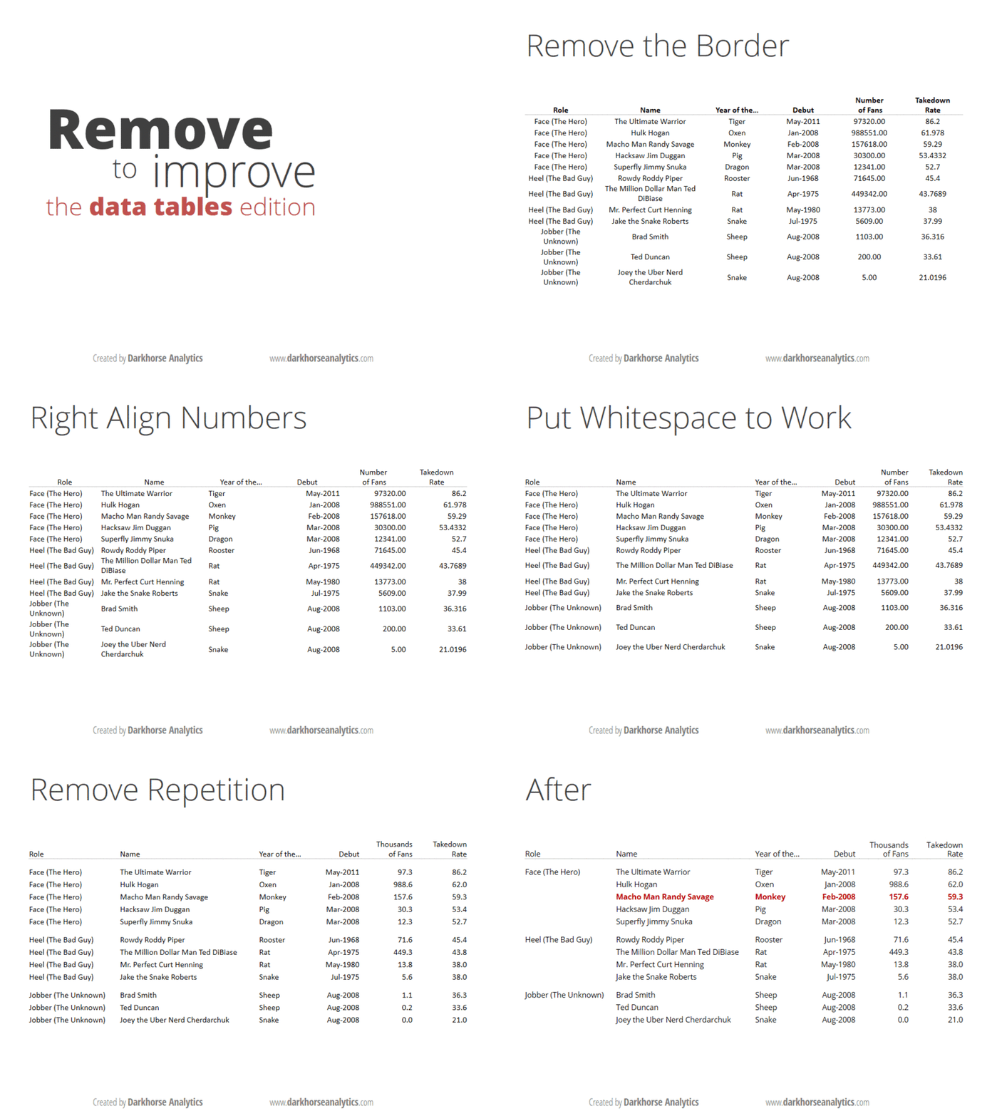
Data is usually explained in tables or charts, but people sometimes commit mistakes when they add in them redundant or boring elements. A good table or chart is worth a thousand words and the following three gifs show how to improve your presentations. Source ↗︎


